 R3842 Light
House, Palmer Park, Detroit, MI
R3842 Light
House, Palmer Park, Detroit, MI
R Series. Excel File 18 cards so far.
|
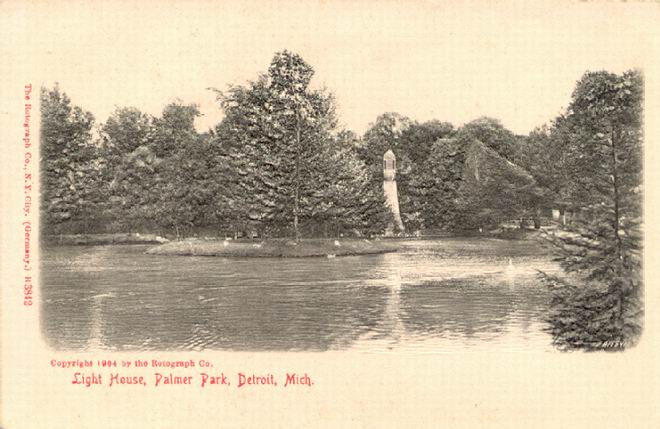
I have just three of these cards. Faulkner describes them correctly as "embossed black and white views with an applied back for easy writing." She says that the views are the same as those in other series, but bas-relief. The idea is ingenious, as one can often tell that embossed backs on greetings troubled those who were trying to write on them. Unfortunately, the 'R' cards tend to curve and separate as a result of the imperfect blending of the two sides or because of moisture and wear. On some, the 'R' looks dangerously like a 'B,' so don't mistake it for a 'B' view. The design offers an odd combination of embossed BW scene, red font on the front, and a very plain udb back with green font in two styles. There may also be a numeral (R3842 in the case below) etched in white ink on the face which is perhaps the number of the same view in the A series. On this card, the trees and lighthouse are in highest relief, the water surface lower relief, and the sky and edges flat. Note the 1904 copyright.
|
R3842 Light
House, Palmer Park, Detroit, MI